August 19, 2026 · Updated August 23, 2026 · 12 min read
What Printer Profile Should You Use in Photoshop for Accurate Prints?
On this page
- Understanding What a Photoshop Printer Profile Does
- Which Printer Profile Should You Choose?
- How to Set Up Photoshop to Manage Color
- Choose the Right Rendering Intent
- Soft Proof Before You Print
- Match Your Monitor to Your Printing Environment
- Common Photoshop Printer Profile Mistakes to Avoid
- Frequently Asked Questions
- Conclusion
What Printer Profile Should You Use in Photoshop for Accurate Prints?
A print that looks perfect on screen can still emerge from the printer too dark, too warm, oversaturated, or strangely dull. In most cases, the problem is not Photoshop itself—it is a color-management mismatch. Choosing the correct Photoshop printer profile is one of the most important steps in producing prints that closely match your edited image.
The right profile depends on your exact printer, ink set, paper, and printing workflow. There is no universal “best” printer profile. Instead, accurate printing comes from matching the profile to the physical materials and ensuring that Photoshop and the printer driver are not both trying to control color.
Key Takeaways
- Use an ICC profile made specifically for your printer model, ink configuration, and paper type.
- Choose either Photoshop or the printer driver to manage color—never both at once.
- Use the paper manufacturer’s profile when printing on third-party fine-art or photo paper.
- Soft proof your image in Photoshop before printing to identify color and tonal compromises.
- Select the correct rendering intent, usually Relative Colorimetric or Perceptual, based on the image.
- Calibrate your monitor so your screen is a trustworthy reference for print editing.
Understanding What a Photoshop Printer Profile Does
A printer profile, also called an ICC profile, is a data file that describes how a particular printer-and-paper combination reproduces color. It helps Photoshop translate the colors in your image into values your printer can reproduce as accurately as possible.
Why Printer Profiles Matter
Monitors create color with light, while printers create color with ink on paper. These are fundamentally different systems. A bright electric blue on a monitor may be impossible to reproduce on matte paper, while a deep black image may print flatter than expected if the wrong media settings are used.
A printer profile accounts for variables such as:
- The printer model
- The installed ink set
- The specific paper surface and coating
- The paper’s white point
- Ink absorption and black density
- The printer’s available color gamut
For example, a glossy photo paper can display deeper blacks and more saturated colors than a textured matte cotton rag paper. If you print a file using a glossy-paper profile while loading matte paper, the result is likely to look inaccurate.
The Profile Is Not the Same as Your Working Color Space
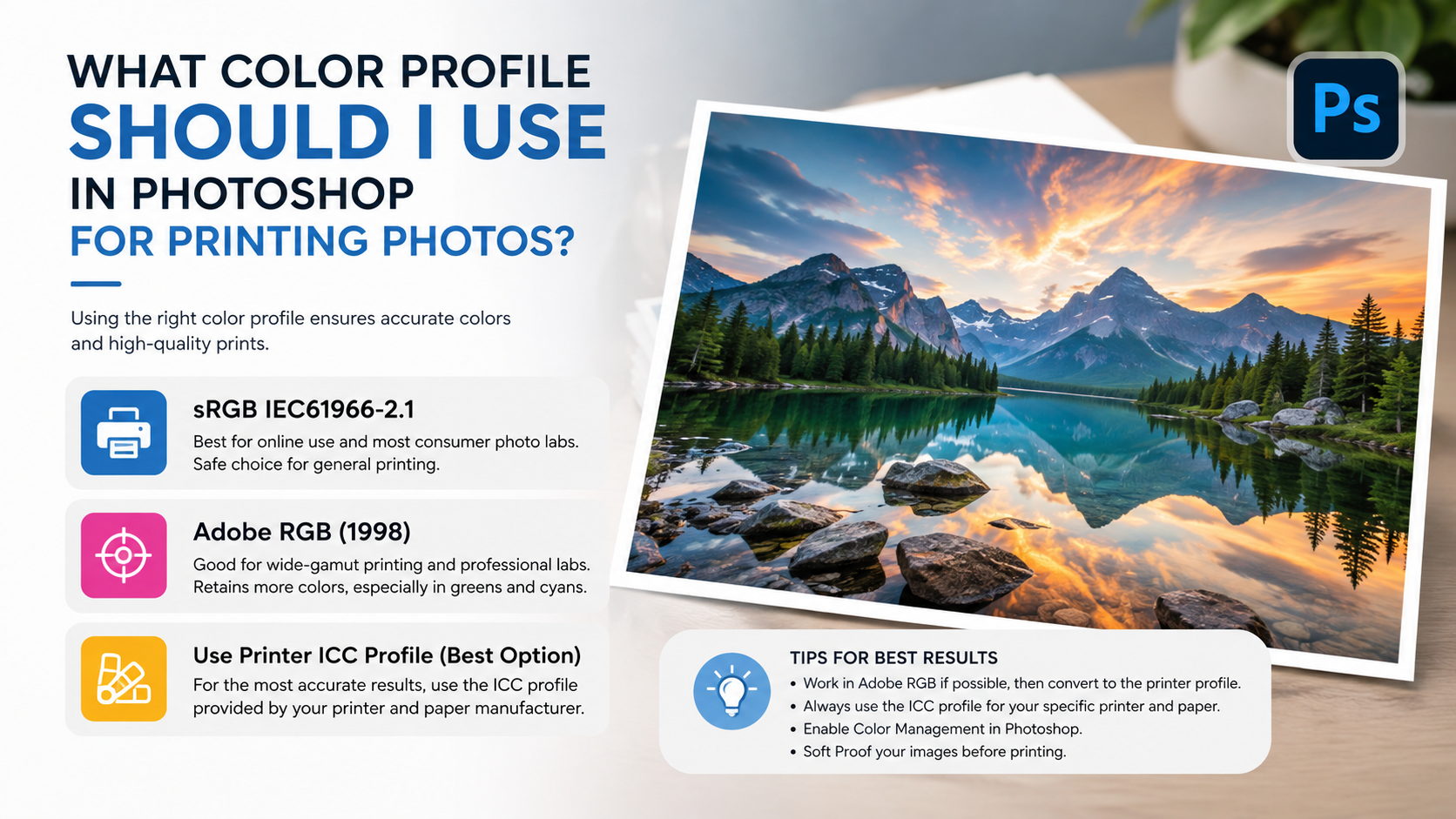
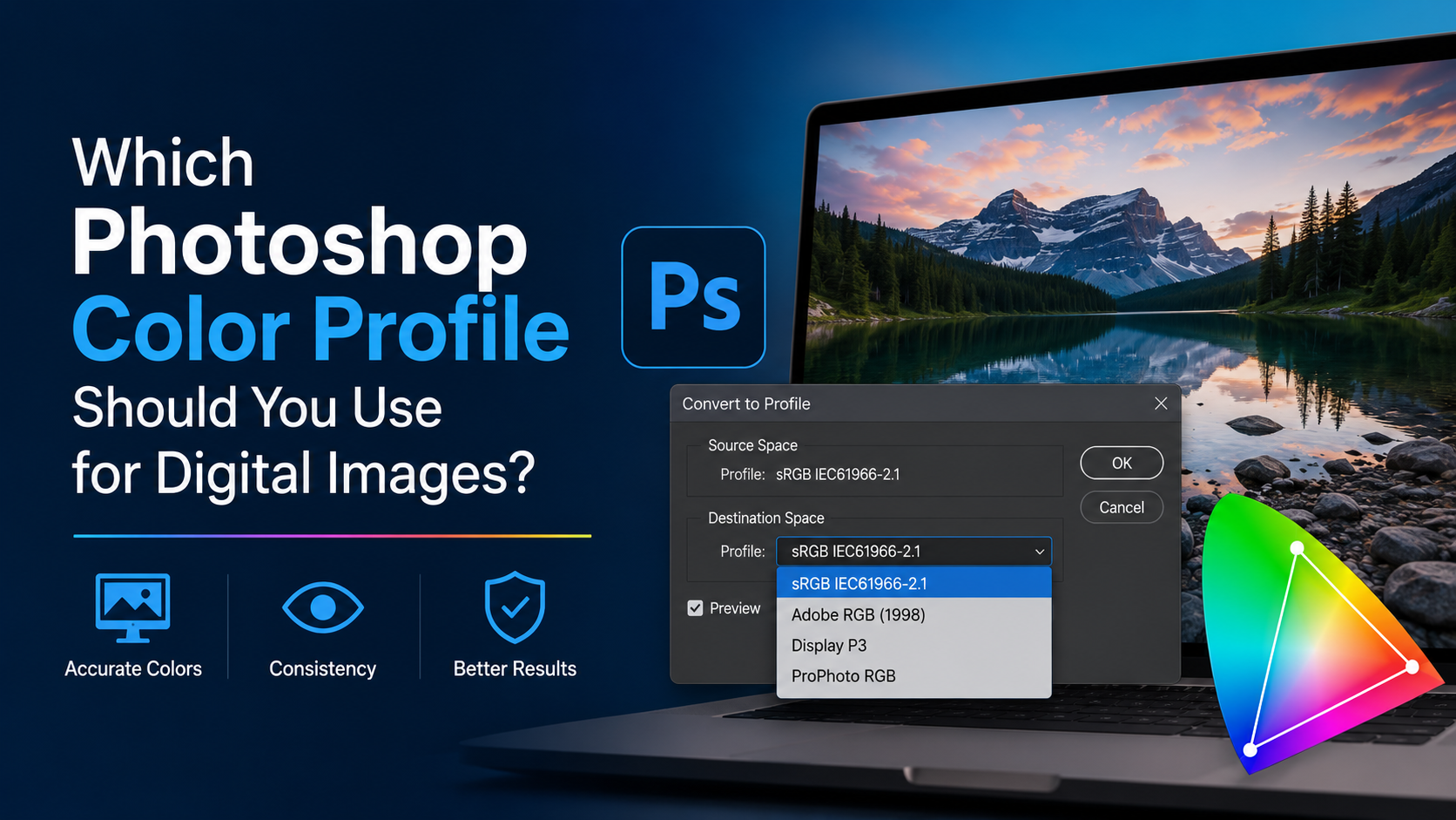
Your image may be edited in sRGB, Adobe RGB, or ProPhoto RGB. Those are working color spaces used to store and edit image color. A printer profile is different: it is the output description Photoshop uses at the final printing stage.
A practical workflow looks like this:
- Edit the image in an appropriate working space, such as Adobe RGB or ProPhoto RGB.
- Soft proof using the intended paper and printer ICC profile.
- Print with that same output profile selected in Photoshop.
- Disable printer-driver color adjustment to prevent double color management.
Which Printer Profile Should You Choose?
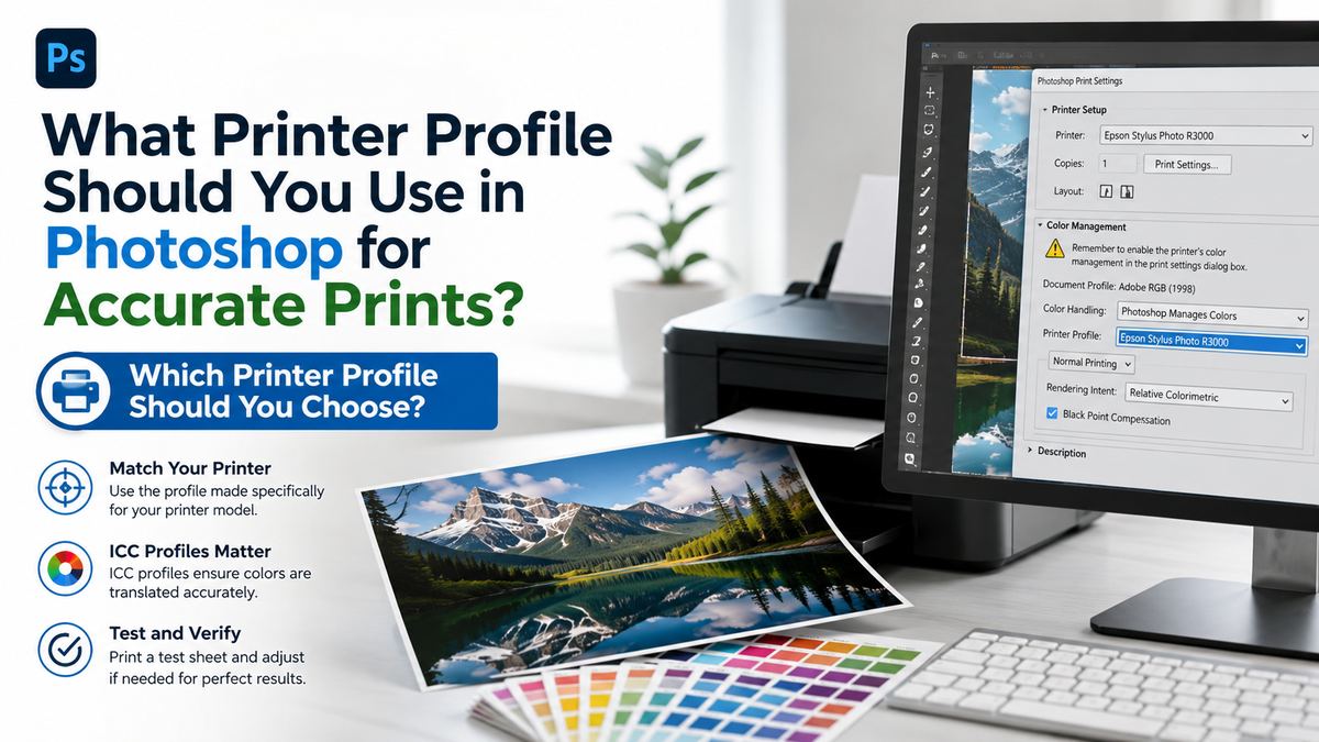
The correct Photoshop printer profile is the one that exactly matches your printer, inks, and paper. Start by identifying your paper brand and type, then look for its recommended profile.
Use the Printer Manufacturer’s Profile for Matching Media
If you are using your printer manufacturer’s own photo paper, select the ICC profile supplied for that printer and media. Canon, Epson, HP, and other printer brands commonly install these profiles with their printer software or provide them through support downloads.
For example:
- An Epson printer loaded with Epson Premium Luster Photo Paper should use the corresponding Epson luster profile.
- A Canon imagePROGRAF printer using Canon Pro Platinum paper should use Canon’s profile for that printer and paper.
- An HP photo printer using HP Advanced Photo Paper should use the profile supplied for that media.
These profiles are usually a reliable starting point because they were built and tested around the manufacturer’s own inks and paper coatings.
Use Paper Manufacturer Profiles for Third-Party Paper
When printing on third-party paper, use the profile provided by that paper manufacturer whenever possible. Fine-art paper companies such as Hahnemühle, Canson, Moab, Red River Paper, and Ilford commonly offer downloadable ICC profiles for specific printer models.
A profile name may look something like:
HFAPhotoRag308EpsonP900_PK.icc
This typically identifies:
- The paper family and weight
- The printer model
- The black ink choice, such as Photo Black or Matte Black
Do not assume a profile for one printer will work properly on another model, even if both use pigment inks. Color behavior can vary significantly between printers.
Consider a Custom Profile for Critical Work
A custom ICC profile is worthwhile when consistency is essential, especially for:
- Fine-art print sales
- Gallery exhibitions
- Product photography
- Brand color reproduction
- Proofing for commercial print
- Specialty papers or nonstandard inks
Custom profiles can be created with profiling hardware and software or ordered from a professional profiling service. They are especially useful if your printer’s behavior changes because of a new ink supplier, a specialty media, or environmental factors.
How to Set Up Photoshop to Manage Color
For most serious photo and art printing workflows, letting Photoshop manage colors provides more control than relying on the printer driver.
Select “Photoshop Manages Colors”
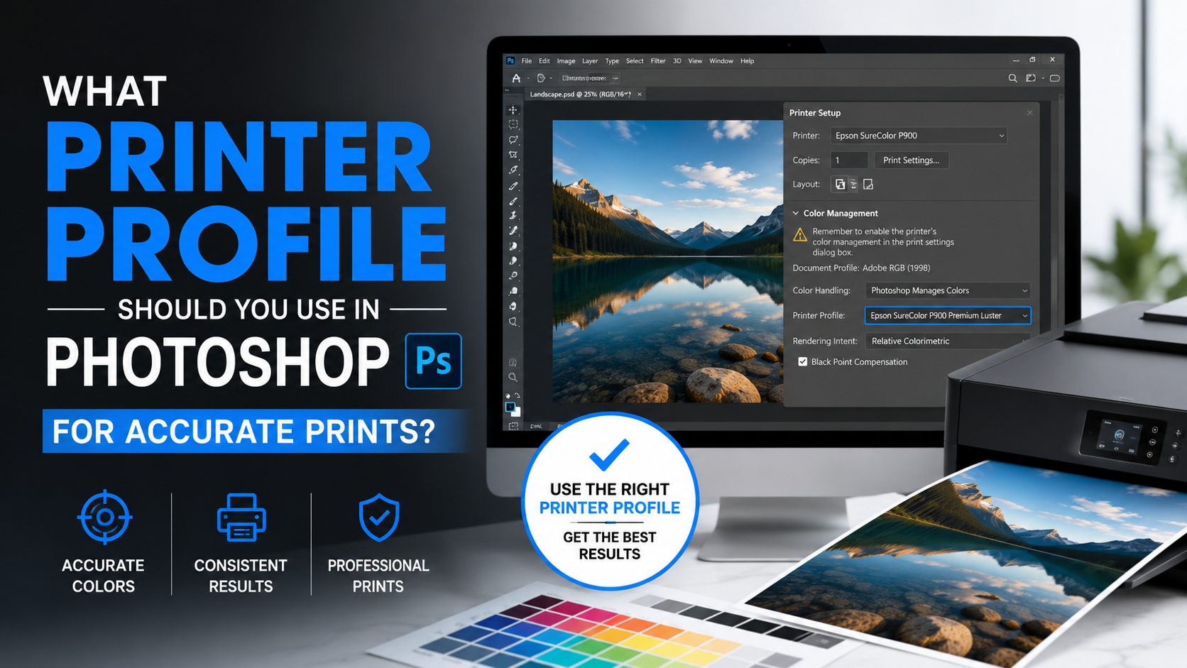
In Photoshop, go to File > Print. In the Color Management section, choose Photoshop Manages Colors.
Then select the correct profile from the Printer Profile dropdown. This should be the profile for the exact paper loaded in your printer.
You will also choose a rendering intent, which tells Photoshop how to handle colors that fall outside the printer-and-paper gamut.
Turn Off Color Management in the Printer Driver
After selecting Photoshop Manages Colors, open the printer settings from the Print dialog. The exact wording varies by brand, but look for controls such as:
- Color Management
- Color Correction
- Printer Color Adjustment
- ICM
- Color Controls
- Driver Matching
Disable these adjustments or select an equivalent option such as No Color Adjustment.
If Photoshop and the printer driver both manage color, you get double color management. Common symptoms include:
- Excessive saturation
- Strong color casts
- Dark or muddy shadows
- Unnatural skin tones
- Inconsistent prints from the same file
Keep Paper Settings Consistent
The profile alone is not enough. Your printer driver’s media type must also match the paper and the profile’s intended setting.
For example, if a paper company specifies “Premium Luster” as the media setting for its profile, choose that exact or closest recommended setting in the driver. The media setting controls ink limits, print resolution, platen gap, black-ink selection, and other printing behavior.
Choose the Right Rendering Intent
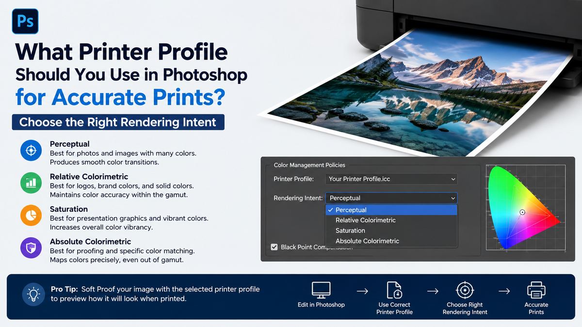
Rendering intent determines how Photoshop maps image colors to the smaller or different color gamut of your printer and paper.
Relative Colorimetric: Best for Many Photographs
Relative Colorimetric preserves in-gamut colors as accurately as possible and clips only colors the printer cannot reproduce. It also adapts the image white point to the paper white.
This is often an excellent choice for:
- Portraits
- Product photography
- Landscapes with moderate saturation
- Images where accurate neutral tones matter
- Prints on high-quality photo papers
Enable Black Point Compensation in most cases when using Relative Colorimetric. It helps preserve shadow detail by mapping the image’s black point to the printer’s available black.
Perceptual: Useful for Highly Saturated Images
Perceptual rendering intent compresses the overall color range so out-of-gamut colors fit more gracefully. Rather than clipping only the extreme colors, it subtly shifts related colors throughout the image.
It can be useful for:
- Highly saturated landscapes
- Vivid flowers and sunsets
- Neon colors
- Digital artwork
- Images with broad color gradients
A perceptual conversion may look slightly less literal, but it can preserve a more natural relationship between colors.
Test Both When the Image Is Important
There is no rendering intent that wins every time. For a critical print, soft proof the image using both Relative Colorimetric and Perceptual, then make a small test print.
A sunset photograph with intense orange and magenta tones may hold together better with Perceptual. A product image with brand-sensitive colors may be better served by Relative Colorimetric.
Soft Proof Before You Print
Soft proofing simulates the selected printer profile on your calibrated display. It will not perfectly duplicate the physical print, but it gives you a valuable preview of gamut limitations, paper white, and shadow changes.
Set Up a Soft Proof in Photoshop
Go to View > Proof Setup > Custom. Then choose:
- Device to Simulate: Your printer-and-paper ICC profile
- Preserve RGB Numbers: Usually leave unchecked
- Rendering Intent: Relative Colorimetric or Perceptual
- Black Point Compensation: Usually enabled
- Simulate Paper Color: Optional but highly useful
- Simulate Black Ink: Helpful for evaluating shadow depth
Turning on Simulate Paper Color often makes the screen preview look flatter or warmer. That is normal. It reflects the fact that paper is not a backlit monitor.
Use Gamut Warning to Find Problem Colors
Choose View > Gamut Warning to highlight colors that the selected printer profile cannot reproduce. These areas are often intensely saturated blues, greens, reds, or bright yellows.
Do not automatically remove every gamut warning. Instead, use it as a guide. You may decide to selectively reduce saturation or adjust hue only where the out-of-gamut colors look distracting in proof view.
A useful example: if a bright green leaf appears dull or clipped in soft proof, use a targeted Hue/Saturation adjustment layer to slightly reduce green saturation while preserving the rest of the image.
Match Your Monitor to Your Printing Environment
Even the best Photoshop printer profile cannot solve a monitor that is too bright, too cool, or poorly calibrated.
Calibrate and Profile Your Display
Use a hardware calibration device from a reputable display-calibration provider for the most dependable results. Calibration establishes targets for brightness, white point, and gamma; profiling measures how your display actually renders color.
Common practical targets include:
- White point: D65 for general photographic work, or D50 for print-focused workflows
- Gamma: 2.2
- Brightness: Often around 80–120 cd/m² for print editing
A monitor that is set too bright is one of the most common reasons prints look darker than expected. If your display feels like a luminous light source while your paper sits under normal room lighting, the print will almost always seem dim by comparison.
Evaluate Prints Under Appropriate Light
View prints under consistent, neutral lighting. Daylight-balanced viewing lights are ideal for critical evaluation because warm household bulbs can make whites appear yellow and alter your perception of color balance.
For professional print approval, avoid judging a print in a dark room or under mixed lighting. A print that looks neutral beside a warm lamp may look cool or magenta in daylight.
Common Photoshop Printer Profile Mistakes to Avoid
Accurate printing is often less about discovering one magic setting and more about avoiding predictable workflow errors.
Using the Wrong Paper Profile
A profile for glossy paper should not be used with matte paper, and a profile for one printer model should not be reused for another. This is the fastest route to inaccurate color and contrast.
Before printing, confirm:
- Printer model
- Paper brand and product line
- Paper finish
- Paper weight, when relevant
- Ink configuration
- Recommended driver media setting
Letting Photoshop and the Printer Driver Both Control Color
This is the classic double color-management issue. If Photoshop manages colors, the driver must not make additional color adjustments.
If your print looks wildly oversaturated or has a strong cyan, magenta, or yellow shift, double-check this setting first.
Editing Without Soft Proofing
An image can look excellent in Adobe RGB or ProPhoto RGB yet contain colors your printer cannot reproduce. Soft proofing lets you make informed adjustments before wasting full-size paper and ink.
Expecting Every Paper to Look the Same
Glossy, luster, baryta, matte, canvas, and textured fine-art papers all render images differently. A profile makes the output predictable, but it does not make a matte print behave like a glossy print.
Choose paper intentionally:
- Glossy or luster for punchy color and deep blacks
- Baryta for rich photographic depth and a premium finish
- Matte cotton rag for subtle tones and fine-art texture
- Canvas for decorative art with a painterly effect
Frequently Asked Questions
Should I use sRGB or Adobe RGB as my Photoshop printer profile?
Neither is typically your printer profile. sRGB and Adobe RGB are working color spaces for your image. For printing, select the ICC profile that matches your printer, ink, and paper combination. You can edit in Adobe RGB or ProPhoto RGB, then let Photoshop convert the file to the correct printer profile during printing.
Should Photoshop or the printer manage colors?
For controlled photographic and fine-art printing, Photoshop should usually manage colors. This gives you direct control over the selected ICC profile and rendering intent. When you choose Photoshop Manages Colors, disable color correction in the printer driver.
Where can I find the right ICC profile for my paper?
Start with your printer manufacturer if you use its branded paper. For third-party media, visit the paper manufacturer’s support or downloads page and look for profiles matched to your printer model. Follow its instructions for installation and recommended printer media settings.
Why do my prints look darker than my screen?
Your display is likely brighter than the viewing conditions for your print. Lower monitor brightness, calibrate your display, soft proof with the intended printer profile, and assess prints under neutral lighting. Also ensure that shadow detail is not being lost during conversion.
Do I need a custom printer profile?
Not always. Manufacturer and paper-company profiles often deliver excellent results. A custom profile becomes valuable when you need repeatable, color-critical output or use specialty papers, alternative inks, or a printer whose output differs noticeably from supplied profiles.
Conclusion
The best Photoshop printer profile is not a generic setting—it is the ICC profile built for your exact printer, ink, and paper combination. Pair that profile with Photoshop-managed color, correct printer-driver settings, a suitable rendering intent, and soft proofing for a dependable print workflow.
Start by downloading the recommended profile for your chosen paper, calibrate your monitor, and make a small proof print before committing to large-format output. That disciplined process turns printing from guesswork into a repeatable, professional result.