August 19, 2026 · Updated August 23, 2026 · 13 min read
What Color Profile Should I Use in Photoshop for Printing Photos?
On this page
- Why Color Profiles Matter for Photo Printing
- The Best Photoshop Working Color Space for Printing
- How to Set Photoshop Color Settings Correctly
- Use Printer ICC Profiles for the Final Print
- Soft-Proof Your Image Before Printing
- Choose the Right Rendering Intent
- Print From Photoshop Without Double Color Management
- File Preparation Beyond the Photoshop Color Profile
- Frequently Asked Questions
- Conclusion
What Color Profile Should I Use in Photoshop for Printing Photos?
A photograph can look perfect on screen yet print too dark, too warm, or strangely muted. In most cases, the camera, printer, and monitor are not “wrong”—they are simply interpreting color differently.
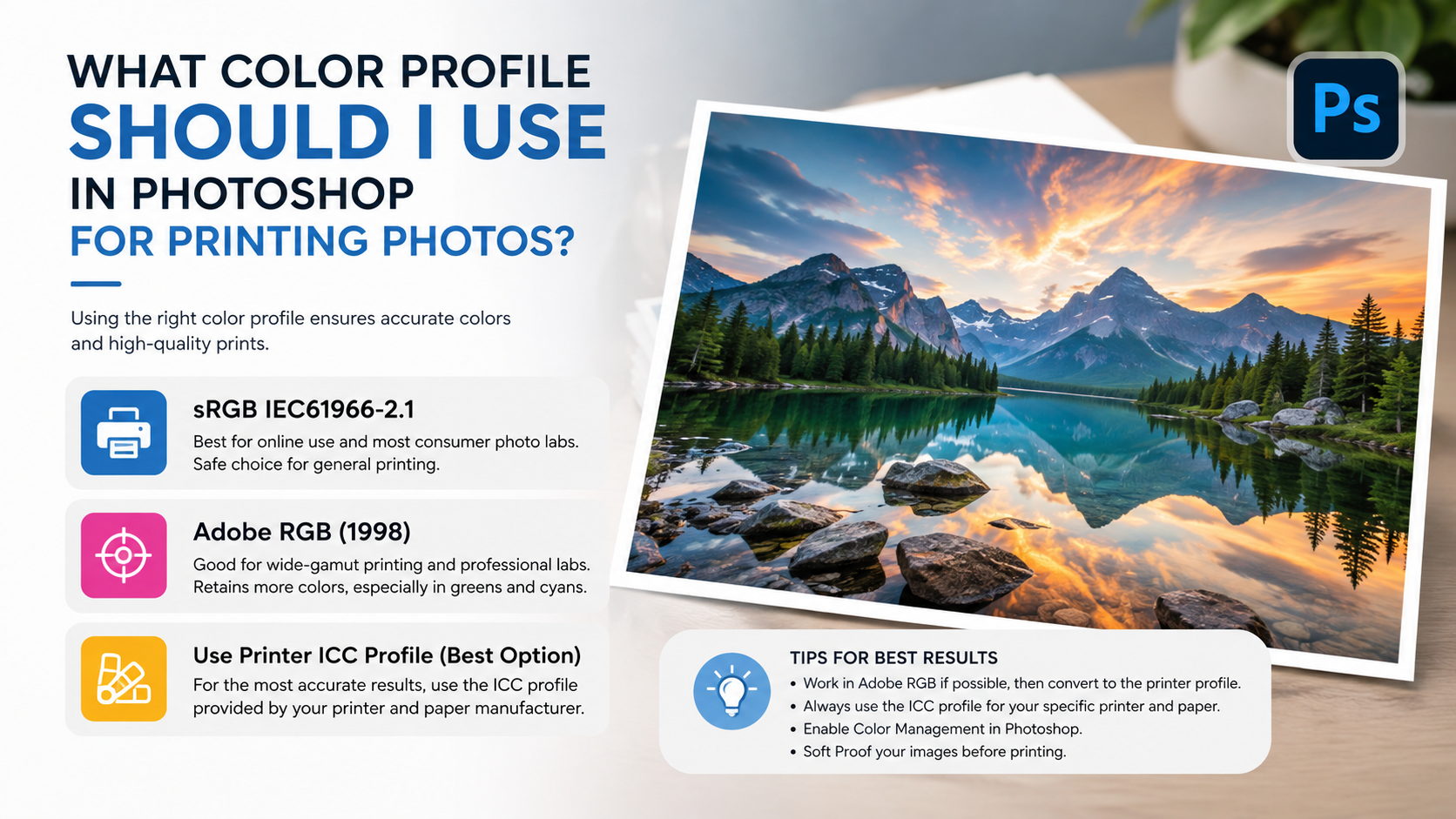
The best Photoshop color profile for printing depends on your printer, paper, lab, and editing workflow. For many photographers, Adobe RGB (1998) is a practical working space; for unmanaged consumer labs, sRGB is often safer; and for the final print, the most important profile is usually the ICC profile supplied for the exact printer-and-paper combination.
This guide explains how to make the right choice and produce prints that closely match your creative intent.
Key Takeaways
- Use the ICC profile for your specific printer, ink, and paper when printing yourself.
- Adobe RGB (1998) is a strong general-purpose editing space for photo printing.
- Use sRGB when a print lab specifically requests it or provides no color-management guidance.
- Use ProPhoto RGB only in a disciplined 16-bit, color-managed workflow.
- Soft-proof in Photoshop before printing to preview gamut limits and paper white.
- Never “Assign Profile” to convert an image for output; use “Convert to Profile.”
Why Color Profiles Matter for Photo Printing
A color profile is a set of instructions that tells software how to interpret the numeric color values in an image. The RGB value 255, 0, 0, for example, does not represent precisely the same visible red in every color space.
The Color-Management Chain
Accurate prints require each part of the workflow to communicate properly:
- Your camera captures color.
- Photoshop interprets and edits that color in a working space.
- Your monitor displays it using its monitor profile.
- Your printer or lab converts it through an ICC profile for its printer, ink, and paper.
When one link is missing or incorrectly configured, colors can shift.
Why Prints Often Look Different from the Screen
Screens emit light, while paper reflects it. A bright monitor can make an image appear more luminous than any print can reproduce. Paper also has its own white point, texture, and maximum black density.
Common causes of disappointing prints include:
- Editing on an overly bright or uncalibrated monitor
- Sending Adobe RGB or ProPhoto RGB files to a lab expecting sRGB
- Letting both Photoshop and the printer manage colors
- Printing without the correct paper profile
- Ignoring soft-proof warnings for out-of-gamut colors
The Best Photoshop Working Color Space for Printing
Your working color space is the profile used while you edit. It affects how much color information your file can hold and how Photoshop translates colors during output.
Adobe RGB (1998): The Best Default for Many Print Workflows
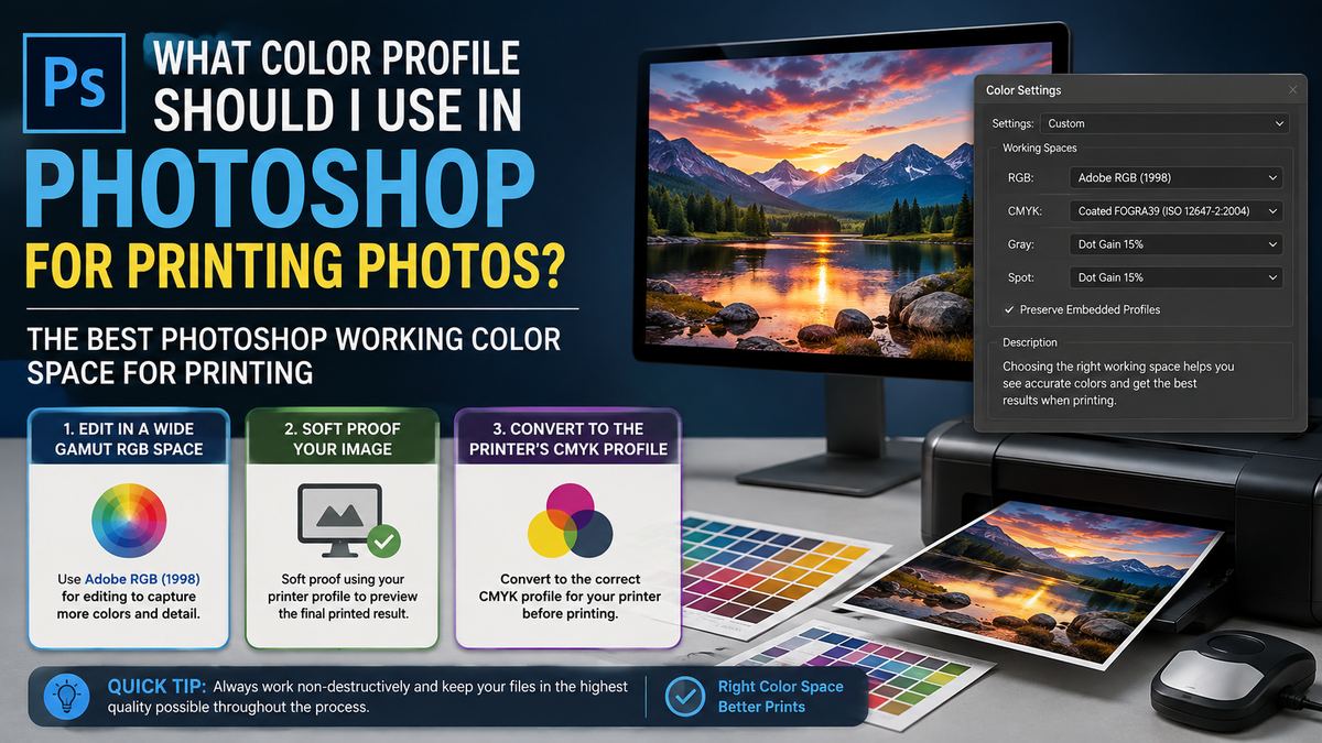
For photographers who print at home or use professional labs, Adobe RGB (1998) is often the most balanced choice. It contains a wider range of greens and cyans than sRGB, which can be useful for landscapes, foliage, turquoise water, and saturated outdoor scenes.
Adobe RGB is a good choice when:
- You print with a quality inkjet printer.
- Your professional lab accepts Adobe RGB files.
- You shoot RAW and edit in Lightroom or Photoshop.
- You want more editing headroom than sRGB without the complexity of ProPhoto RGB.
For example, a landscape image with bright spring foliage may retain smoother, richer greens in Adobe RGB than in sRGB—provided the printer and paper can reproduce them.
sRGB: The Safest Choice for Consumer Labs and General Sharing
sRGB is the most widely supported color space. It is the default for browsers, many consumer print services, social platforms, and basic photo kiosks.
Choose sRGB when:
- Your print lab explicitly asks for sRGB.
- A lab does not state its preferred color space.
- You are uploading photos to a consumer printing website.
- The file will also be used online or shared broadly.
sRGB has a smaller gamut than Adobe RGB, but predictable handling can matter more than theoretical color range. Sending an Adobe RGB file to a system that assumes sRGB can produce flat, undersaturated prints.
ProPhoto RGB: Powerful but Best for Advanced Workflows
ProPhoto RGB has an extremely wide gamut, including colors that no monitor or printer can display. It can preserve more data during RAW editing and intensive adjustments, but it demands care.
Use ProPhoto RGB only when:
- You work in 16-bit mode.
- You understand color management and gamut conversion.
- You are editing high-quality RAW files.
- You will soft-proof and convert intentionally for the final print.
Because ProPhoto RGB is so large, 8-bit files can develop banding or posterization more easily during heavy edits. It is not automatically the best Photoshop color profile for printing; it is a high-capacity editing space that must eventually be converted thoughtfully for output.
How to Set Photoshop Color Settings Correctly
Photoshop’s color settings establish how it handles RGB images, embedded profiles, and profile mismatches.
Recommended General RGB Settings
Open Edit > Color Settings in Photoshop. For a photo-print workflow, a solid starting point is:
- RGB Working Space: Adobe RGB (1998)
- CMYK Working Space: Leave at the standard required for your commercial print workflow
- Color Management Policies: Preserve Embedded Profiles
- Profile Mismatches: Ask When Opening
- Missing Profiles: Ask When Opening
Preserving embedded profiles is important. An image prepared in sRGB should remain sRGB when opened; Photoshop should not silently reinterpret it as Adobe RGB.
Working Space vs. Embedded Profile
These terms are easy to confuse:
- A working space is your preferred editing environment.
- An embedded profile tells Photoshop how a specific file’s existing color values should be interpreted.
- A printer ICC profile describes how a particular printer, ink, and paper reproduce color.
If you open an sRGB image while Adobe RGB is set as the working space, Photoshop can preserve the image’s sRGB profile. It does not need to convert the file merely because your default working space is Adobe RGB.
Assign Profile vs. Convert to Profile
This distinction is essential.
Assign Profile changes Photoshop’s interpretation of the existing RGB numbers without changing the numbers themselves. It can radically alter the image’s appearance and is mainly used when a file has been tagged incorrectly or has no profile.
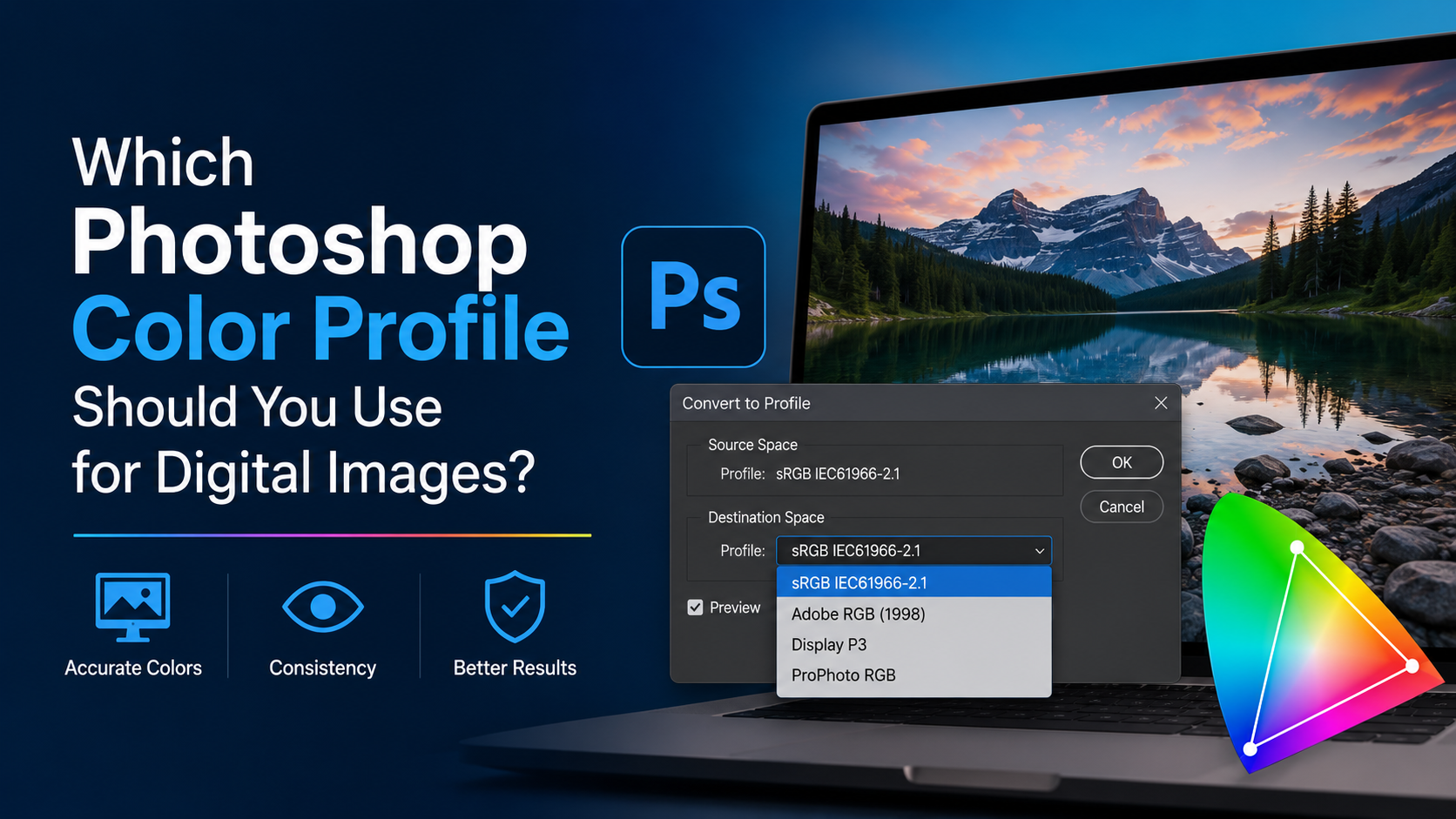
Convert to Profile changes the RGB numbers so the image keeps a similar visual appearance in a new color space. This is the option you normally use for print preparation.
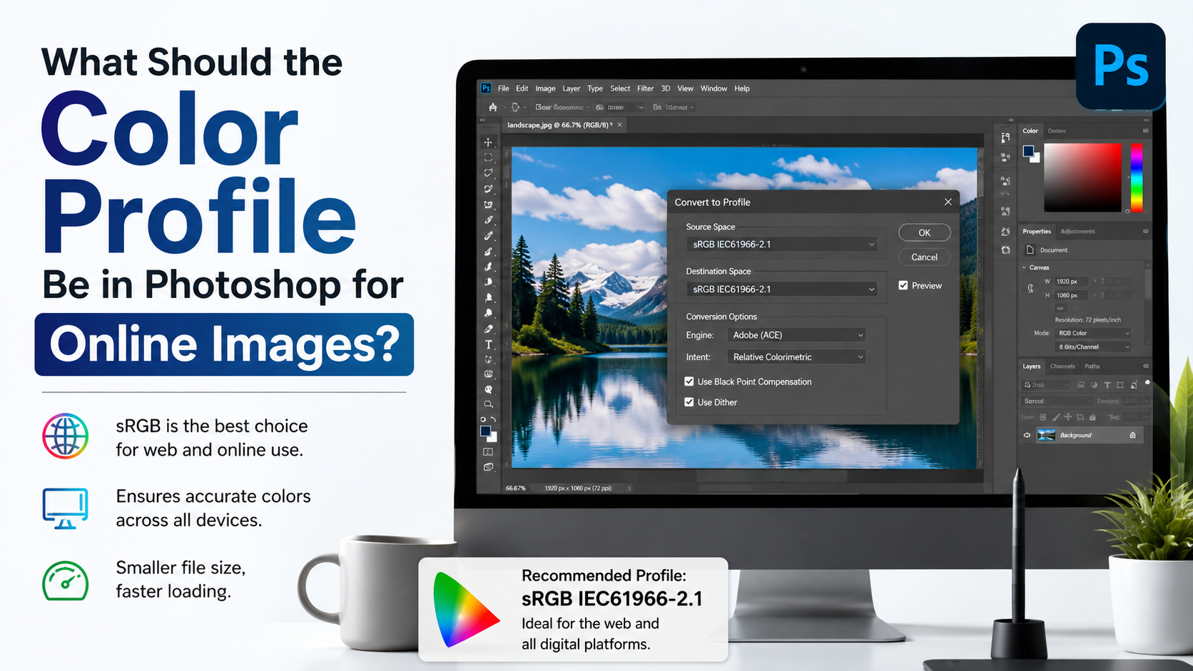
For instance, if a consumer lab requires sRGB, use Edit > Convert to Profile, select sRGB IEC61966-2.1, and embed the profile when saving.
Use Printer ICC Profiles for the Final Print
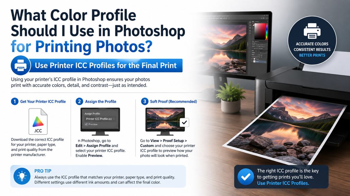
The printer ICC profile is usually the most important piece of the print workflow. It describes the behavior of a particular printer using particular inks on particular paper.
Why Paper-Specific Profiles Matter
Glossy, matte, baryta, canvas, and fine-art cotton papers all absorb and reflect light differently. The same image printed on two paper stocks can have different contrast, saturation, black depth, and color balance.
Use a profile matched to:
- Your printer model
- The installed ink set
- The exact paper brand and paper type
- The correct print quality and media settings
A profile for glossy paper is not interchangeable with one for matte fine-art paper.
Where to Get ICC Profiles
You can usually obtain profiles from:
- Your printer manufacturer
- The paper manufacturer
- A professional print lab
- A custom profiling service
For a home Epson, Canon, or HP photo printer, the printer driver may include profiles for the manufacturer’s own papers. Premium paper brands often offer free downloadable ICC profiles for major printer models.
What to Ask a Professional Lab
Before submitting an important job, ask the lab:
- Which color space should uploaded files use?
- Do you provide downloadable printer/paper ICC profiles?
- Should files be converted to the lab profile, or should they remain in Adobe RGB or sRGB?
- Do you apply automatic color correction?
- What file format, resolution, and sharpening guidelines do you recommend?
If the lab provides an ICC profile, follow its instructions exactly. Some labs want you to soft-proof with their profile but submit an Adobe RGB or sRGB file; others request conversion before upload.
Soft-Proof Your Image Before Printing
Soft proofing simulates, as closely as possible, how your image will look on a chosen printer-and-paper combination. It is one of the most valuable steps in professional print preparation.
How to Soft-Proof in Photoshop
Go to View > Proof Setup > Custom and choose:
- Device to Simulate: Your printer/paper ICC profile
- Preserve RGB Numbers: Off
- Rendering Intent: Start with Relative Colorimetric
- Black Point Compensation: On
- Simulate Paper Color: Optional, but useful for realistic previewing
- Simulate Black Ink: Useful for assessing shadow depth
Then toggle View > Proof Colors to compare the original display with the print simulation.
Check Gamut Warnings
Select View > Gamut Warning to highlight colors your chosen printer/paper combination cannot reproduce. Highly saturated blues, greens, reds, and fluorescent-looking colors are common problem areas.
Do not treat every warning as an emergency. Instead, assess whether the affected area looks unnatural in the proof. You may selectively reduce saturation, adjust hue, or use adjustment layers targeted to the problem colors.
Make a Print-Specific Adjustment Layer
Rather than changing your master file permanently, create proof-specific adjustment layers. Typical refinements include:
- Slightly increasing midtone brightness for matte paper
- Recovering or opening blocked-up shadows
- Reducing an overly intense blue or green
- Adding restrained output sharpening
- Fine-tuning contrast after enabling paper simulation
Name the layer clearly, such as “Matte Paper Print Adjustments,” and keep it separate from your master edits.
Choose the Right Rendering Intent
When Photoshop converts colors from one profile to another, some colors may fall outside the printer’s gamut. Rendering intent controls how Photoshop handles those colors.
Relative Colorimetric: Usually the Best Starting Point
Relative Colorimetric preserves in-gamut colors accurately and maps only out-of-gamut colors to the closest printable color. With Black Point Compensation enabled, it often delivers natural photographic results.
It is especially useful when:
- The image contains mostly printable colors.
- Accurate neutral tones matter.
- You want saturated colors to remain as faithful as possible.
Perceptual: Useful for Highly Saturated Images
Perceptual rendering compresses the entire image gamut to preserve visual relationships among colors. It may be preferable for images with many out-of-gamut colors, such as intensely saturated sunsets, neon scenes, or vivid flower photography.
A practical approach is simple: soft-proof with both Relative Colorimetric and Perceptual, then choose the one that produces the more pleasing result for that specific image.
Absolute Colorimetric: Mainly for Proofing
Absolute Colorimetric attempts to simulate the paper’s white point. It is useful for contract proofing and evaluating how a print stock affects appearance, but it is less commonly the preferred choice for final photographic output.
Print From Photoshop Without Double Color Management
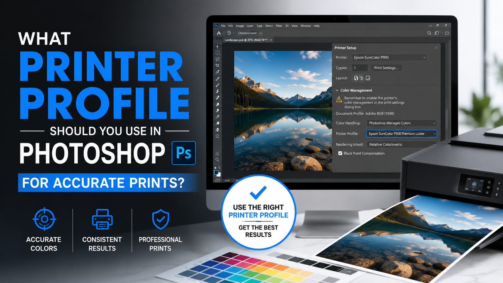
Double color management happens when Photoshop converts the image using an ICC profile and the printer driver performs another conversion. The result can be excessively saturated, dull, shifted, or unpredictable.
Recommended Home-Printing Setup
In Photoshop, choose File > Print and set:
- Color Handling: Photoshop Manages Colors
- Printer Profile: Your selected printer-and-paper ICC profile
- Rendering Intent: Relative Colorimetric or Perceptual
- Black Point Compensation: Enabled
Then open the printer driver settings and disable its color adjustment or color management. The wording varies by manufacturer, but look for options such as:
- No Color Adjustment
- Color Management Off
- Application Manages Colors
- Disable Printer Color Matching
Only one system should manage color.
When the Printer Manages Colors
Letting the printer manage colors can be acceptable for quick drafts or when no suitable ICC profile is available. In that case, select Printer Manages Colors in Photoshop and avoid selecting a separate printer profile in Photoshop.
For final portfolio, client, exhibition, or product prints, Photoshop-managed color with a correct ICC profile is generally more controllable.
File Preparation Beyond the Photoshop Color Profile
The profile is crucial, but it is not the only factor affecting print quality.
Use Enough Resolution
A common target for photographic printing is 240–300 pixels per inch at the final print size. For example:
- An 8 × 10-inch print at 300 ppi needs approximately 2400 × 3000 pixels.
- A 16 × 20-inch print at 240 ppi needs approximately 3840 × 4800 pixels.
Large-format prints can often look excellent at lower resolutions because they are viewed from farther away.
Sharpen for the Intended Output
A file that looks ideally sharp on screen may look slightly soft in print. Print sharpening should account for final size and paper type:
- Glossy papers often need less aggressive sharpening.
- Matte and textured fine-art papers may benefit from a modest extra boost.
- Resize first, then apply output sharpening on a separate layer or duplicate file.
Embed the Profile When Exporting
When saving a JPEG or TIFF for a print lab, embed the color profile unless the lab specifically says otherwise. In Photoshop’s save or export dialog, look for options such as Embed Color Profile or ICC Profile.
An embedded profile tells the receiving system how to interpret the file correctly.
Frequently Asked Questions
Should I use Adobe RGB or sRGB for printing photos?
Use Adobe RGB (1998) for many home-printer and professional-lab workflows because it offers more color range than sRGB. Use sRGB when your lab requests it, when the lab gives no color-management guidance, or when using a consumer printing service that may assume sRGB.
Should I convert my photo to the printer ICC profile before printing?
Usually, no. For home printing, it is often best to keep the image in its editing space, select the printer ICC profile in Photoshop’s Print dialog, and let Photoshop perform the conversion during printing. Convert the actual image file only when a lab explicitly instructs you to do so.
Is ProPhoto RGB better than Adobe RGB for printing?
Not necessarily. ProPhoto RGB can retain more color data during 16-bit RAW editing, but printers cannot reproduce its full gamut. Adobe RGB is simpler and highly capable for many print workflows. The quality of your printer profile, soft proofing, monitor calibration, and print settings matter more than choosing the largest possible working space.
Why does my print look darker than my monitor?
Monitors emit light and are often set too bright, while prints reflect ambient light. Calibrate your monitor, lower its brightness to a realistic level, soft-proof in Photoshop, and evaluate prints under suitable lighting. A small print-specific midtone adjustment may also be necessary.
Should Photoshop or the printer manage colors?
For consistent, controlled photo printing, choose Photoshop Manages Colors and disable color management in the printer driver. If both Photoshop and the driver manage color, you risk double conversion and inaccurate results.
Conclusion
There is no single Photoshop color profile for printing that is perfect in every situation. Adobe RGB (1998) is an excellent general working space for photographers, sRGB is the dependable choice for many consumer labs, and ProPhoto RGB is best reserved for advanced 16-bit workflows.
For the final output, prioritize the ICC profile that matches your exact printer, ink, and paper—or follow your print lab’s specifications. Soft-proof your image, use one color-management system, embed the correct profile, and make test prints when the result matters.
Before sending your next important photo to print, download the correct printer or lab ICC profile and soft-proof the image in Photoshop. That one step can turn a screen-only edit into a print you are genuinely proud to frame.