August 19, 2026 · 13 min read
Which Photoshop Color Profile Should You Use for Digital Images?
On this page
- What Is a Photoshop Color Profile?
- The Best Photoshop Color Profile for Most Digital Images: sRGB
- When Adobe RGB Is the Better Choice
- When to Use ProPhoto RGB
- Understanding CMYK Profiles for Print
- How to Choose the Right Color Profile by Project Type
- Color Settings That Prevent Photoshop Profile Mistakes
- Monitor Calibration and Soft Proofing Matter More Than Profile Choice Alone
- Frequently Asked Questions
- Conclusion
Which Photoshop Color Profile Should You Use for Digital Images?
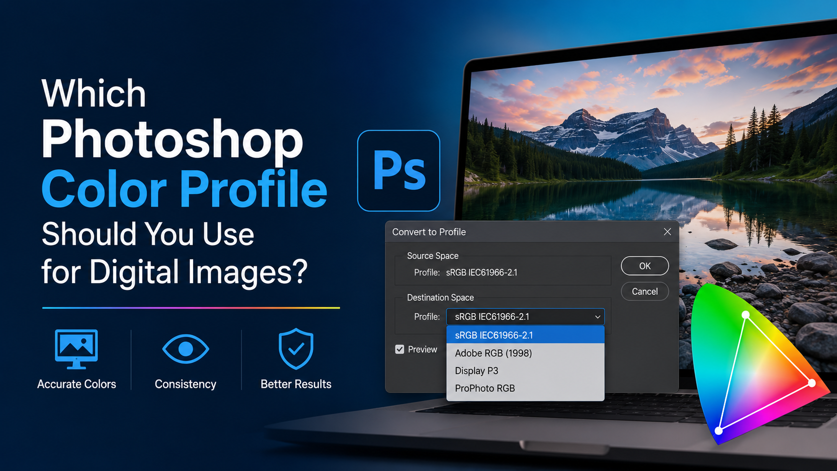
Choosing a Photoshop color profile can feel like a technical detail—until your vivid image turns dull online, your print looks unexpectedly different, or a client sees colors you never intended. The right profile is what keeps color consistent as an image moves from camera to Photoshop, web browser, phone, monitor, or printer.
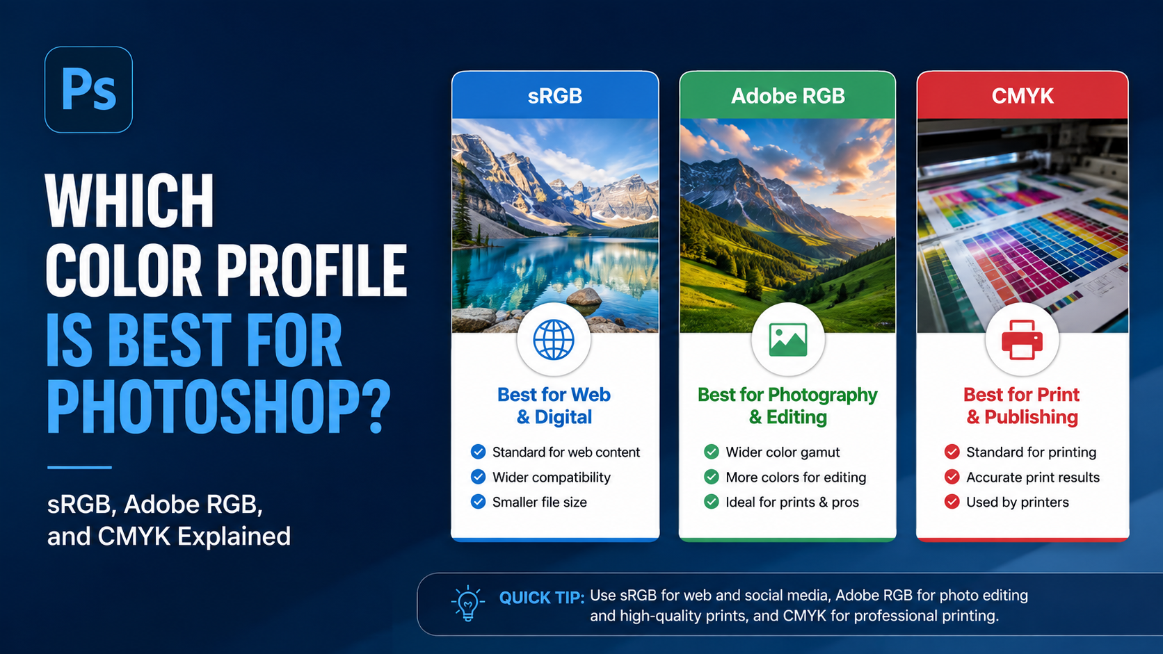
For most digital images intended for websites, social media, presentations, and general screen viewing, sRGB is the best Photoshop color profile. But photographers, print professionals, and designers working with wide-gamut files may need Adobe RGB, ProPhoto RGB, or a specific CMYK printer profile.
This guide explains how Photoshop color profiles work, which option fits each use case, and how to prevent costly color-management mistakes.
Key Takeaways
- Use sRGB for websites, social media, email, presentations, and most digital delivery.
- Choose Adobe RGB when preserving a wider color range for high-quality print workflows.
- Use ProPhoto RGB only with high-bit-depth professional photography files and a managed workflow.
- Convert to a printer’s requested CMYK profile only when the print provider specifically requires it.
- Embed a color profile when saving files so other devices and applications interpret colors correctly.
- Calibrate your monitor if color accuracy matters for photography, design, or commercial print work.
What Is a Photoshop Color Profile?
A Photoshop color profile is a set of instructions that defines how numeric color values should appear. A pixel with RGB values of 255, 0, and 0 is “red,” but the exact shade of red can vary depending on the color space used.
Color profiles give Photoshop and other applications a shared reference point. They tell the software what a file’s reds, greens, blues, and neutrals are supposed to look like.
Why RGB Numbers Are Not Enough
Digital images are made from color values, but those values need context. Without a profile, a device has to guess how to display the image.
For example:
- An image edited in Adobe RGB may look rich and saturated in Photoshop.
- If that same image is uploaded without its profile, some browsers or apps may assume it is sRGB.
- The image can then appear flatter, less saturated, or shifted in hue.
This is why color management is not just a concern for print shops. It matters whenever images move between devices.
Working Space vs. Monitor Profile
These two concepts are often confused:
- Working space: The color profile assigned to the file you edit, such as sRGB or Adobe RGB.
- Monitor profile: A profile describing how your specific display reproduces color.
You select a working space for your images. Photoshop uses your monitor profile behind the scenes to show a preview that is as accurate as possible.
The Best Photoshop Color Profile for Most Digital Images: sRGB
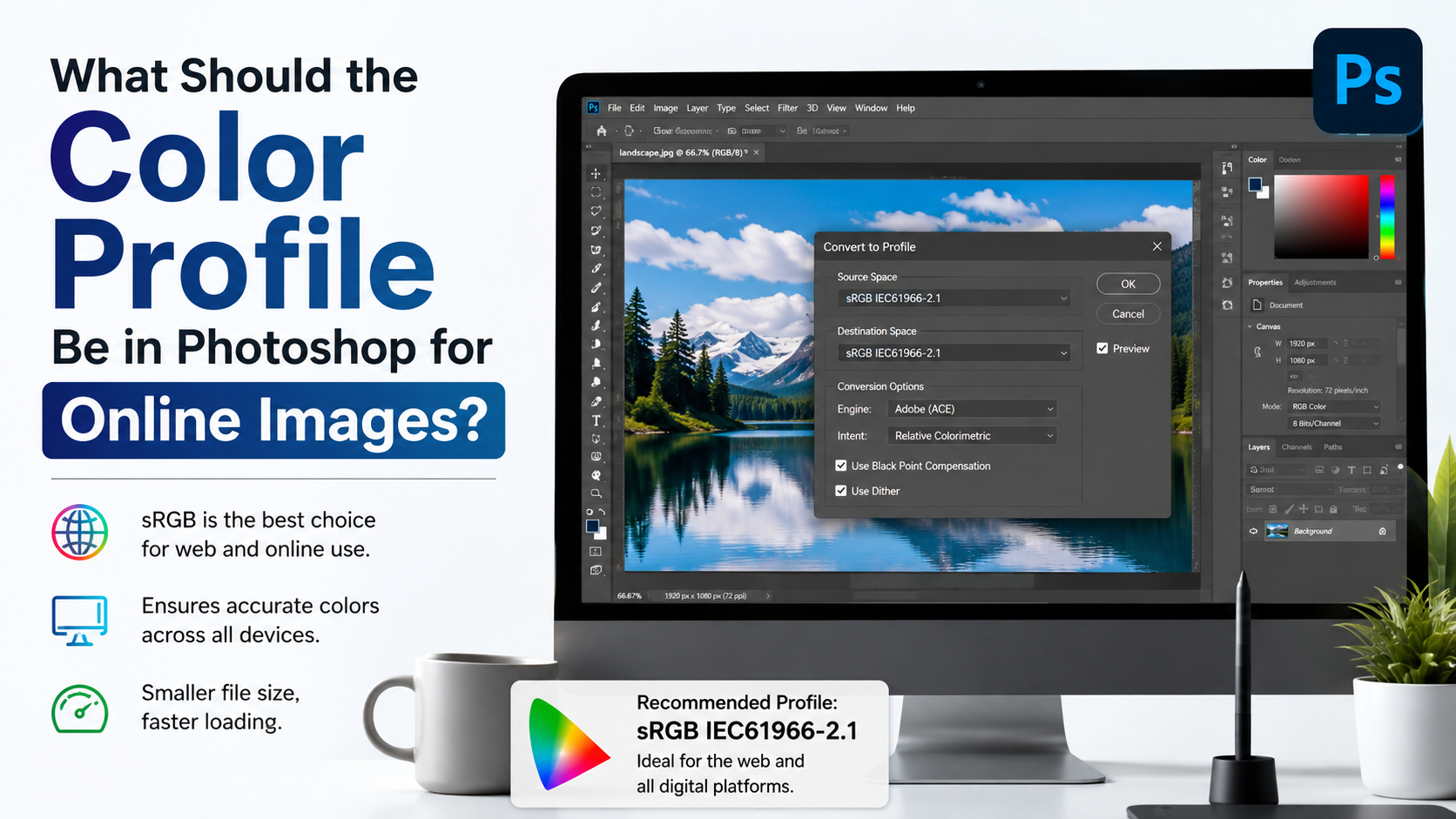
For general digital content, sRGB IEC61966-2.1 is the safest and most reliable choice. It is the standard color space for the web and is widely supported by browsers, phones, tablets, consumer displays, and everyday software.
When to Use sRGB
Use sRGB when creating images for:
- Websites and blogs
- Social media posts
- Online stores and product photos
- Email newsletters
- Slide decks and PDFs for screen viewing
- Client previews
- Digital ads
- JPEGs delivered to a broad audience
If you are unsure where an image will be viewed, sRGB is usually the right answer.
Why sRGB Works So Well Online
sRGB has a smaller color gamut than Adobe RGB or ProPhoto RGB, meaning it cannot represent as many highly saturated colors. That sounds limiting, but its broad compatibility makes it practical.
A photo with slightly less possible saturation that appears consistently across devices is usually better than a wider-gamut file that displays incorrectly for part of your audience.
For example, an e-commerce brand should export product images in sRGB. Consistent color is more valuable than retaining a tiny amount of extra gamut that many shoppers may never see accurately.
How to Set sRGB in Photoshop
Go to:
Edit > Color Settings
Under Working Spaces, select:
RGB: sRGB IEC61966-2.1
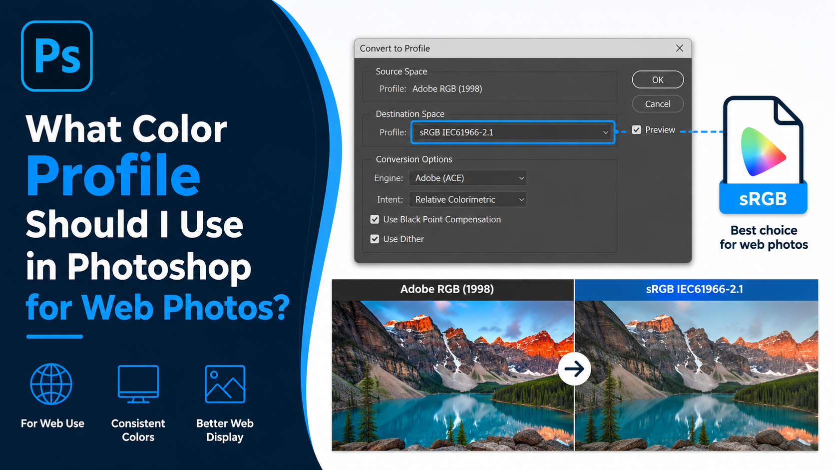
When exporting, use File > Export > Export As and make sure Convert to sRGB is enabled for web-bound files.
When Adobe RGB Is the Better Choice
Adobe RGB (1998) includes a wider range of colors than sRGB, particularly in cyan-green areas. It is commonly used by photographers and print professionals who want to preserve more color information from a capable camera or scanner.
Best Uses for Adobe RGB
Adobe RGB can be a good Photoshop color profile for:
- Fine-art photography
- High-end inkjet printing
- Commercial photography with a controlled workflow
- Images intended for professional print production
- Archival master files that may be printed later
It is especially useful when your camera captures Adobe RGB or when you work with RAW images and expect to make large color adjustments.
The Main Risk of Adobe RGB
Adobe RGB files must be handled correctly. If a workflow does not honor embedded profiles, the image may look muted compared with the Photoshop version.
For instance, a landscape photographer may edit a lush green image in Adobe RGB. When the file is posted to an older content system that strips profiles, the greens may lose vibrancy or shift noticeably.
The solution is simple: keep Adobe RGB for your master or print version, then export a separate sRGB copy for online publication.
Adobe RGB for Print Does Not Mean “Always Better”
A wider color space does not automatically improve every print. The printer, paper, ink, and print process determine what colors can actually be reproduced.
If a print lab requests sRGB files, follow its instructions. Sending Adobe RGB when the lab expects sRGB can create unpredictable results. Always check the printer’s specifications before converting files.
When to Use ProPhoto RGB
ProPhoto RGB is an extremely wide-gamut color space. It can contain colors beyond what most monitors and printers can display, making it useful for preserving color data during advanced photo editing.
However, it is not the best default Photoshop color profile for everyday work.
Who Should Use ProPhoto RGB?
ProPhoto RGB is most appropriate for:
- Professional photographers editing RAW files
- Fine-art image makers
- Retouchers performing substantial color grading
- High-bit-depth workflows, especially 16-bit images
- Archival master files with future output flexibility
Lightroom and Adobe Camera Raw commonly use a ProPhoto-based workflow internally because it preserves extensive color data from modern RAW files.
Why Bit Depth Matters
ProPhoto RGB should generally be used in 16-bit mode, not 8-bit mode. Its large gamut spreads color values over a wide range. In 8-bit files, aggressive editing can increase the risk of banding, posterization, and visible transitions in skies or gradients.
A practical professional workflow might look like this:
- Process a RAW photo in Adobe Camera Raw.
- Open it in Photoshop as a 16-bit ProPhoto RGB file.
- Complete major retouching and color adjustments.
- Save a layered master file.
- Convert a duplicate to sRGB for web or to the printer’s requested profile for output.
Why ProPhoto RGB Is Not Ideal for Everyday Exports
Most screens cannot display its full gamut, and many platforms do not handle it reliably. Never assume that a ProPhoto RGB image is suitable for direct upload to a website or social platform.
Use it for high-quality editing, then convert deliberately for delivery.
Understanding CMYK Profiles for Print
RGB profiles are designed for light-emitting displays. CMYK profiles are designed for ink on paper. When you convert an image from RGB to CMYK, Photoshop maps screen colors into the smaller range that a particular printing process can reproduce.
Do You Need to Convert to CMYK Yourself?
Usually, only convert to CMYK if:
- Your printer specifically requests a CMYK file.
- The printer provides an ICC profile or exact CMYK standard.
- You are preparing offset-print artwork, such as packaging, brochures, or magazines.
- You need to inspect out-of-gamut colors before production.
For many modern photo labs and digital printers, it is better to submit an RGB file—often sRGB—and let the lab’s RIP software manage conversion.
Common CMYK Profiles
The correct CMYK profile depends on region, paper stock, and printing conditions. Examples include:
- U.S. Web Coated (SWOP) v2 for some U.S. commercial workflows
- Coated GRACoL 2006 for certain North American sheetfed printing
- FOGRA39 or newer FOGRA profiles for many European workflows
- A custom ICC profile supplied by a print vendor
Never choose a CMYK profile based only on its name. Ask the printer which profile, ink limit, paper type, and PDF standard they require.
Soft Proof Before Converting
Before committing to CMYK, use Photoshop’s soft-proofing tools:
View > Proof Setup > Custom
Select the printer’s ICC profile and enable Preview. You can also activate:
View > Gamut Warning
This highlights colors that cannot be reproduced by the selected print condition. A bright neon blue or intensely saturated green may need adjustment before printing.
How to Choose the Right Color Profile by Project Type
The best Photoshop color profile depends less on personal preference and more on the image’s final destination.
Web, Social Media, and Digital Marketing
Choose sRGB.
A marketing team creating banner ads, Instagram graphics, and website photography should use sRGB from start to finish or convert final exports to sRGB. It minimizes surprises across browsers and mobile devices.
Professional Photography and Fine-Art Printing
Use Adobe RGB or ProPhoto RGB for master editing files, depending on your workflow and bit depth.
Then create a separate output file based on the print lab’s guidance. A gallery print may benefit from Adobe RGB, but only if the printer supports it and you are working with a managed print pipeline.
Commercial Design and Offset Printing
Begin in RGB when appropriate, but convert to the exact requested CMYK profile only at the production stage.
Keeping images in RGB while designing often preserves more editing flexibility. Convert once the printer’s requirements are confirmed and use proofing to manage expected color changes.
Mixed or Unknown Delivery Requirements
Keep a high-quality master file, then export separate versions:
- A master PSD or TIFF in Adobe RGB or ProPhoto RGB
- An sRGB JPEG or PNG for web use
- A printer-ready file using the vendor’s requested profile
This approach prevents one output format from compromising another.
Color Settings That Prevent Photoshop Profile Mistakes
Photoshop’s Color Settings control how the application handles new files, imported images, and profile mismatches.
Recommended Color Settings for General Users
For most screen-first workflows:
- RGB Working Space: sRGB IEC61966-2.1
- CMYK Working Space: Use your printer’s recommendation or a common regional default
- Color Management Policies: Preserve Embedded Profiles
- Profile Mismatches: Ask When Opening and Ask When Pasting
The most important setting is preserving embedded profiles. This prevents Photoshop from silently changing how a file appears.
What to Do When Photoshop Shows a Profile Mismatch Warning
When opening a file, Photoshop may ask whether to preserve, convert, or discard a profile.
In most cases, choose Preserve Embedded Profile. This keeps the image interpreted as its creator intended.
Choose Convert Document’s Colors to the Working Space only when you have a deliberate reason to standardize the file. For example, converting an Adobe RGB stock image to sRGB before adding it to a web campaign can be sensible.
Avoid Discard the Embedded Profile unless you know the file was tagged incorrectly. Removing a valid profile can make colors display incorrectly.
Embed the Profile When Saving
When saving or exporting, enable Embed Color Profile whenever possible. This gives browsers, design apps, and print software the information needed to display your colors correctly.
For web exports, the ideal combination is usually:
- Convert to sRGB
- Embed the sRGB profile
- Export at appropriate pixel dimensions and compression
Monitor Calibration and Soft Proofing Matter More Than Profile Choice Alone
Even the correct Photoshop color profile cannot fix an inaccurate monitor. If your screen is too blue, too warm, too bright, or overly saturated, your editing decisions may still be wrong.
Calibrate Your Display for Reliable Editing
Professional photographers, designers, and print-focused creators should calibrate their displays with a hardware calibration device. This creates a monitor profile that Photoshop can use for more reliable previews.
Calibration helps you avoid common problems such as:
- Prints that appear darker than your screen version
- Skin tones edited too warm or too cool
- Shadows that look open on-screen but print nearly black
- Over-saturated images caused by an overly vivid display mode
Use Soft Proofing for Print Decisions
Soft proofing simulates a printer and paper combination on-screen. It cannot perfectly reproduce paper, ink, and viewing-light conditions, but it provides a valuable preview.
Use it before sending expensive print jobs, especially for:
- Product packaging
- Art prints
- Fashion photography
- Brand colors
- Large-format graphics
- Images with saturated blues, greens, oranges, or reds
A five-minute soft-proofing check can prevent a costly reprint.
Frequently Asked Questions
Should I use sRGB or Adobe RGB in Photoshop?
Use sRGB for images that will primarily be viewed online or on standard screens. Use Adobe RGB when you are preserving color for professional printing and know the full workflow supports it. For many people, sRGB is the best all-purpose choice.
Is ProPhoto RGB better than Adobe RGB?
ProPhoto RGB has a larger gamut, but it is not automatically better. It is best for advanced 16-bit RAW editing where preserving maximum color information matters. Adobe RGB is easier to manage and often more practical for print-oriented photography.
Should I convert every Photoshop file to CMYK for print?
No. Convert to CMYK only when your print provider specifically requests it. Many print labs prefer RGB files and perform their own conversion. Always follow the printer’s documented requirements.
Why do my Photoshop colors look different after uploading online?
The image may be in Adobe RGB or ProPhoto RGB, the platform may be ignoring its embedded profile, or the file may have been exported without converting to sRGB. Export a copy as sRGB with the profile embedded for more consistent online color.
Can I change a Photoshop color profile after editing?
Yes. Use Edit > Convert to Profile to convert colors while preserving appearance as closely as possible. Avoid simply assigning a new profile unless the file was incorrectly tagged, because assigning changes how Photoshop interprets the existing color values.
Conclusion
The right Photoshop color profile is determined by where your image will go next. Use sRGB for dependable digital display, Adobe RGB for managed print workflows, and ProPhoto RGB for high-end 16-bit photo editing. Convert to a specific CMYK profile only when a print provider requires it.
The most reliable habit is to maintain a high-quality master file, export tailored versions for each destination, and always embed the correct profile. Review your Photoshop Color Settings today, standardize your export workflow, and make your next image look as intended wherever it is seen.
Advertisement